Logos of the Minnesota Wild
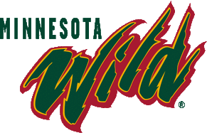
Figure 2. The Minnesota Wild's Main Logo |
Figure 2 depicts the Minnesota Wild's main logo. This logo is the original logo created at the inception of the hockey team and is still widely used on the players' jerseys, merchandise, and advertising campaigns. The Wild's logo is one of the best logos in the NHL in terms of representing the essence of its home state.
Matt Majka, head of the Wild's Marketing Department in 1998, was striving to create a logo that "captured the wilderness and outdoors theme" out of which he wanted to base the team's brand and identity (Andreson, 2011). Thus, with the assistance of SME (a New York design firm), this logo was born. |
|
The color scheme of the main logo is as follows: Iron Range Red (#C51230), Forest Green (#004F30), Harvest Gold (#F1B310), Minnesota Wheat (#EEE3C7), and White (#FFFFFF) (Team Color Codes, 2016). The naming of the colors reflects the desire to create a brand related to the Minnesota wilderness. All of these colors are naturally occurring in the Minnesota wilderness. The "Iron Range Red" color is represented in the many mines located in the northern part of the state, which is referred to as "The Iron Range" of Minnesota. |
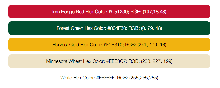
Figure 3. Colors of the Wild |
The "Forest Green" refers to all of the trees, shrubs, grass, and other plants that grow rampantly in Minnesota. The "Harvest Gold" can refer to the sun, the harvest moon, or yellow plants like sunflowers or squash that are found in the southern part of the state. The "Minnesota Wheat" color is, of course, in reference to the wheat grown in southern Minnesota. The "White" color is used solely in the shooting star in the upper part of the logo, referencing the starry nights that many Minnesotans enjoy due to the lack of bright city lights.
The colors present in the logo appeal to the audience because they represent the defining characteristic of Minnesota: nature. These natural colors help the logo represent the Minnesota landscape. This appeals to pathos because the fans are able to identify with the colors on an emotional level. Not many states can label red as a natural part of the landscape; Minnesota is unique because the mining industry is such a massive part of the state's economy.
Green and red are complimentary colors, which means that they are in high contrast of one another (Tiger Color, 2015). This contrast creates a vibrant appearance that adds visual appeal to the logo. The issue with using green and red as a major component of the logo is that in the United States, people tend to associate the combination of these two colors with Christmas. It can be dangerous to use these colors unless done with careful thought. The Wild have carefully thought through their color choices and they succeed in using these colors because they are so closely related to the the natural colors of the Minnesota landscape. Not all people in the United States will be able to make the connection to the red and the Iron Range, but the Minnesota Wild is not targeting this broad audience. For the target audience, these colors work to represent Minnesota and are recognizable, especially when the audience is provided with the names of the colors (Fig. 3).
The color scheme and natural theme is present in many other Minnesota-based brand logos including Caribou Coffee, the Minnesota Timberwolves, Duluth Pack, Land 'O Lakes, and many Minnesota beer companies. Clearly, Minnesota-based brands all have a similar understanding of their target audience's interests and what appeals work well with that audience.
The Wild's main logo contains an overall appeal to pathos. Specifically, the designers of this logo are appealing to the assumed audience's positive associations with the outdoors. The logo is meant to invoke feelings of happiness because of the many outdoor activities available to Minnesotans: fishing, boating, swimming, hunting, hiking, etc. It could perhaps invoke feelings of nostalgia with childhoods spent outdoors.
Figure 4: Alternate Logos |
There are many variations of the Wild's logo. Like other teams in the NHL, the Wild occasionally wear alternative jersey designs. Teams tend to feature alternative jersey/logo designs to generate income through the sales of new merchandise. These alternative Wild logos vary in style and theme, but they stay consistent with usage of the main color: Forest Green. It is important to consistently use this main color to preserve the identity of the brand and represent nature.
|